
Binx Health
Binx Health provides at-home testing, a point-of-care device, and a clinician portal to help reduce the spread of STIs.
Leading UX & Creative Direction at binx
I joined binx Health in 2019 as the UX and Creative Director. My job was to build a UX foundation and provide a creative direction for our brand in all our platforms. This included communicating and overseeing the design work from various contractors and a design agency we used to help with UX.
Planning For The Future
Early on I set goals for myself and the UX team. An overhaul of our product design doesn’t come overnight, but it was also necessary to create a roadmap of what my plan for UX was and where we would like to be six months down the road, something I could bring to leadership to discuss and make sure it aligned with our overall product goals for the next few quarters.

Part of our UX roadmap
Design System
One thing I want to have before I even start a redesign project, is a style guide of some sort. It can be the most basic design system, but something that will be used by designers (in-house and contractors) to make sure all designs moving forward are consistent and follow WCAG 2.0 AA accessibility requirements.
binx had a simple style guide, but it lacked clarity and didn’t match the style guide marketing was using. As someone who loves design systems, I was disappointed but also very excited to build a new one.
Building a new design system doesn’t mean completely killing any existing styles and starting from scratch. I kept the base colors - though expanded on that by creating a more useful color system. With the color and typography updates, I then took the existing components and gave them a facelift. I then added additional styles, components, and included rules and examples for each.
When completed my plan was to take all necessary brand elements and put together a separate guidelines document for marketing to use. Except this time both would be consistent and follow necessary requirements.
Samples of the design system
Redesign
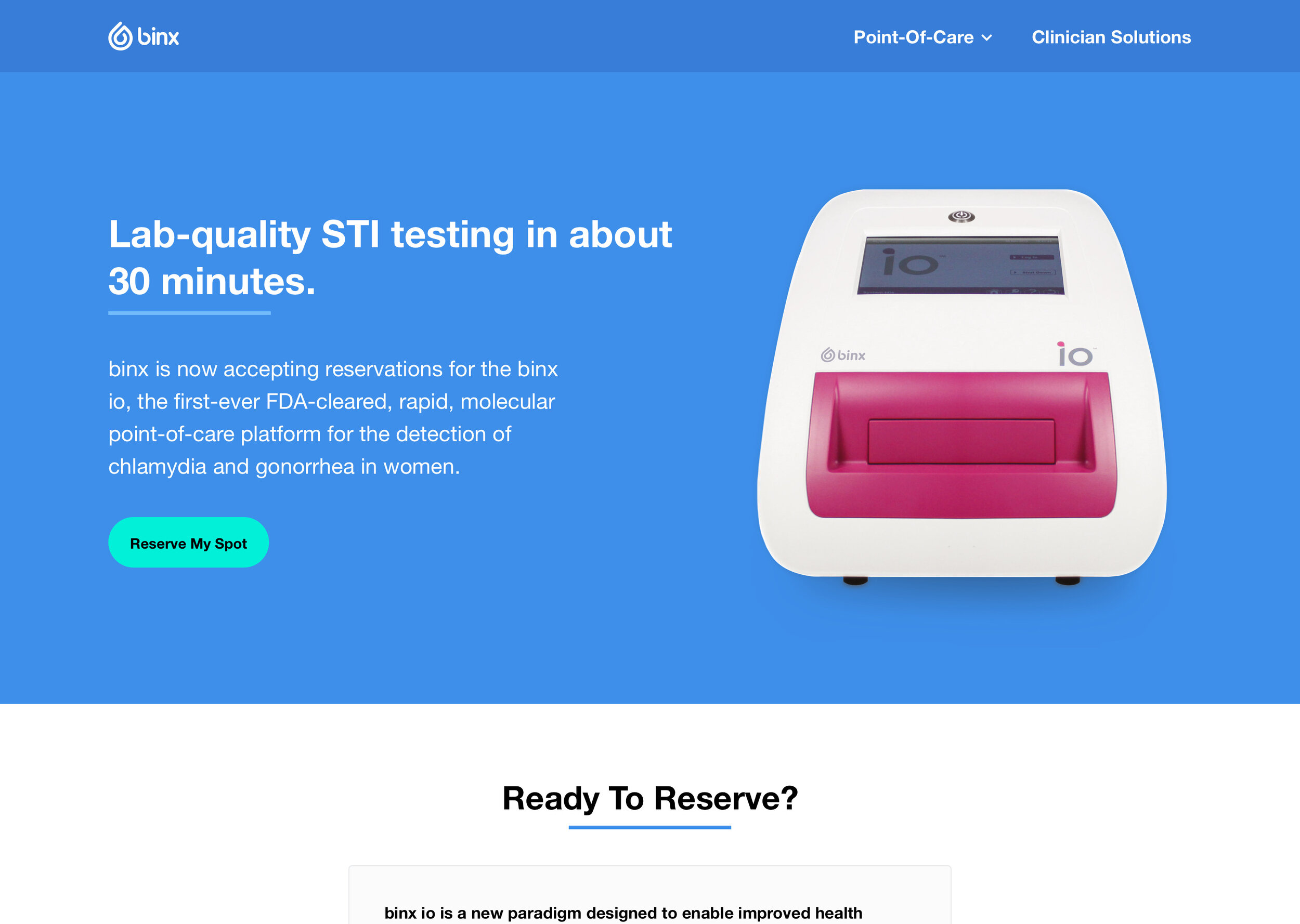
The main binx website targeted two audiences: B2C and B2B. The problem is it served B2C primarily. We wanted to update this so users coming from B2C (campaigns, events, etc) were getting the right information without any distractions or information about clinician items not related to their experience with the at-home product. We also wanted B2B clients and potential partners to come to a site with the right information about our FDA-approved POC.

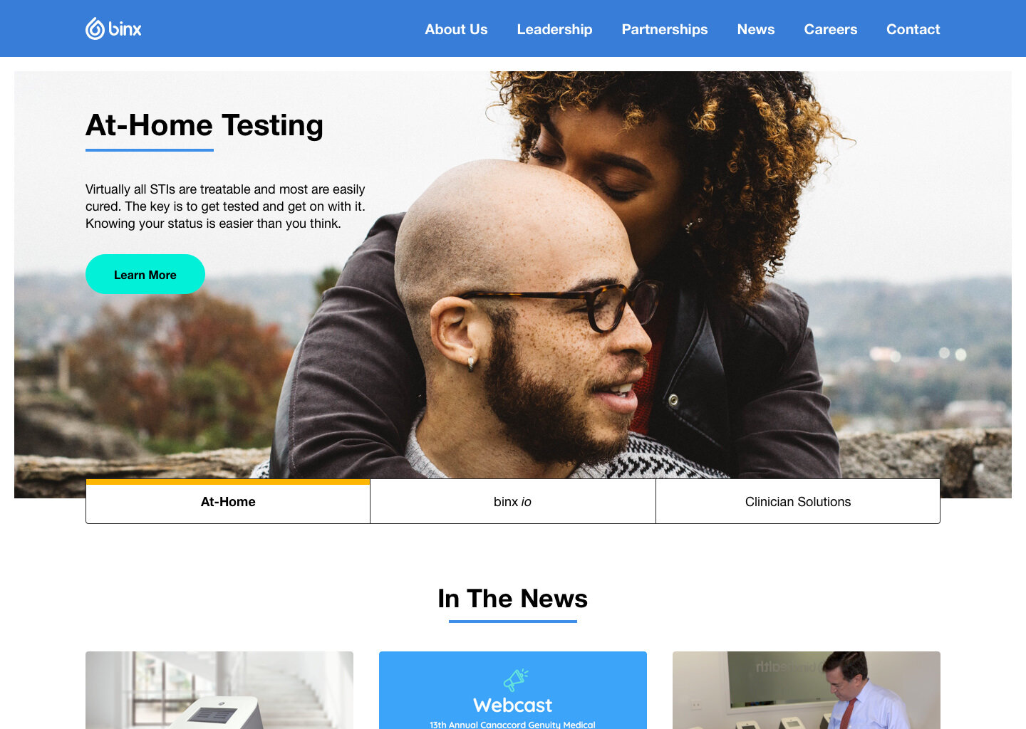
Consumer-focused homepage (old)
Corporate & B2C
Instead of packing all the information for our consumers and partners into one website, we decided to split each into its own site (while still having an easy way to navigate between each via the footer).
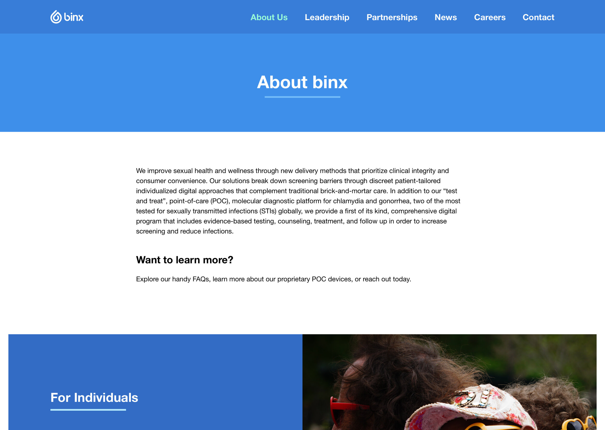


Our corporate landing page would house all company information including who we are, news, partnerships, careers, etc. While also being a quick gateway to our B2C and B2B sites.
Consumer
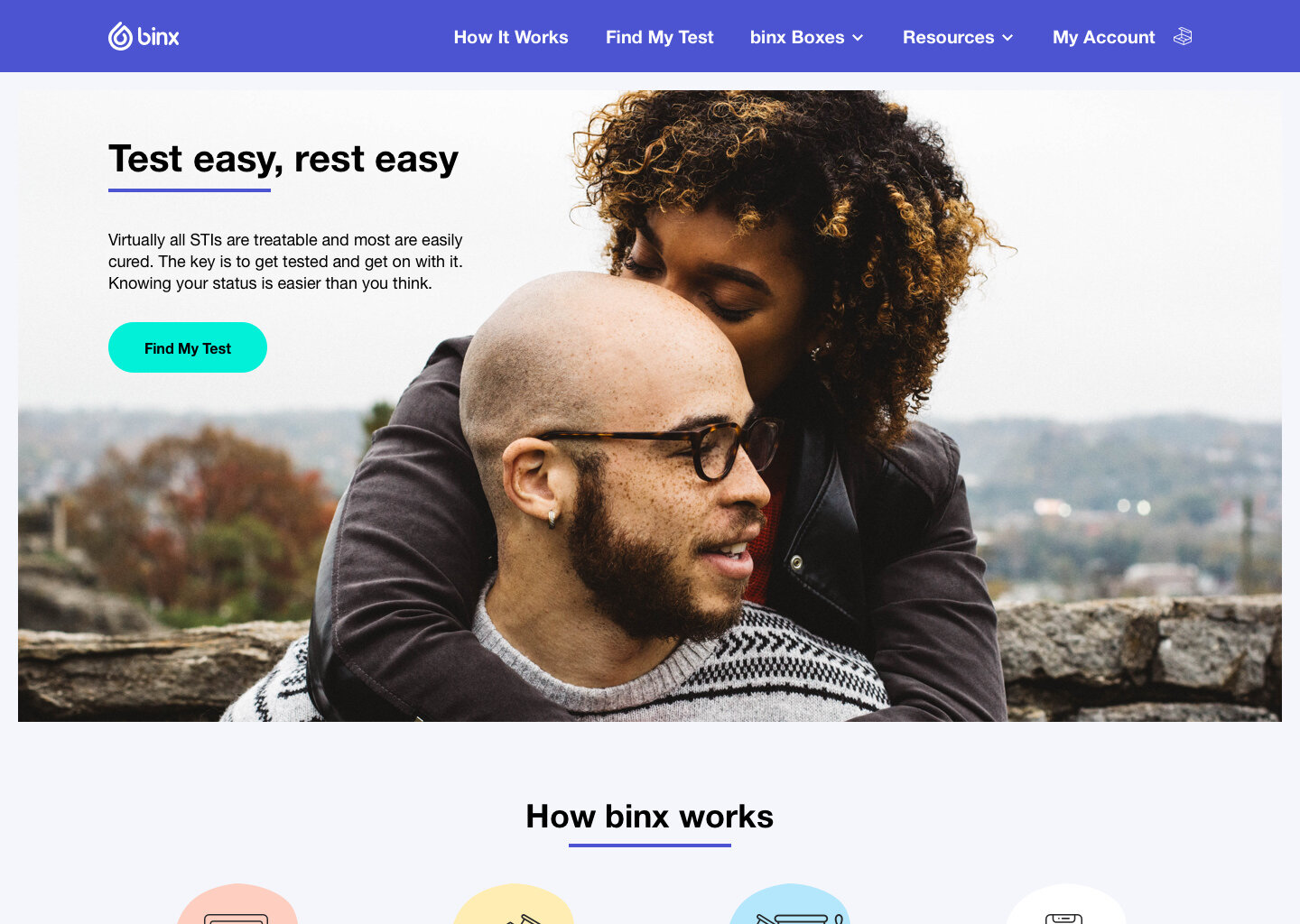
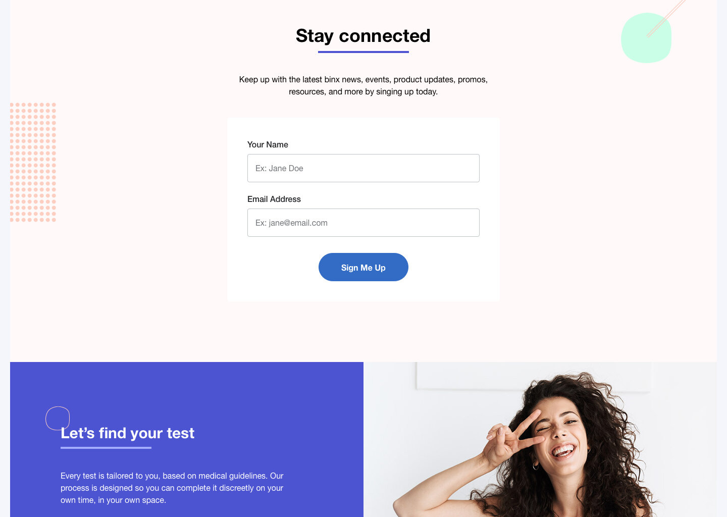
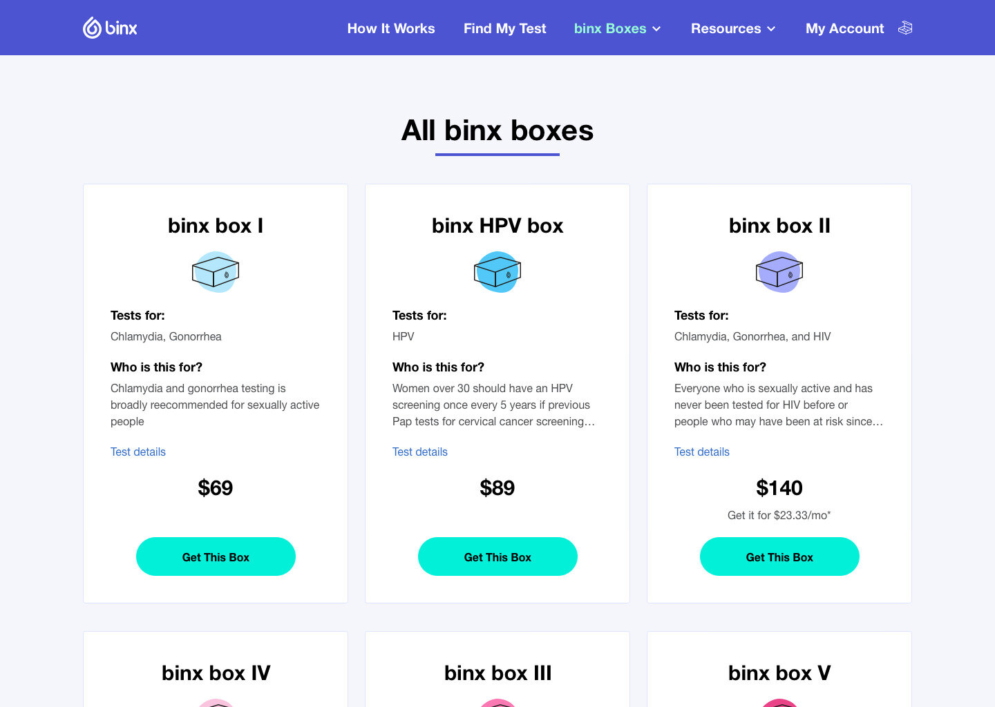
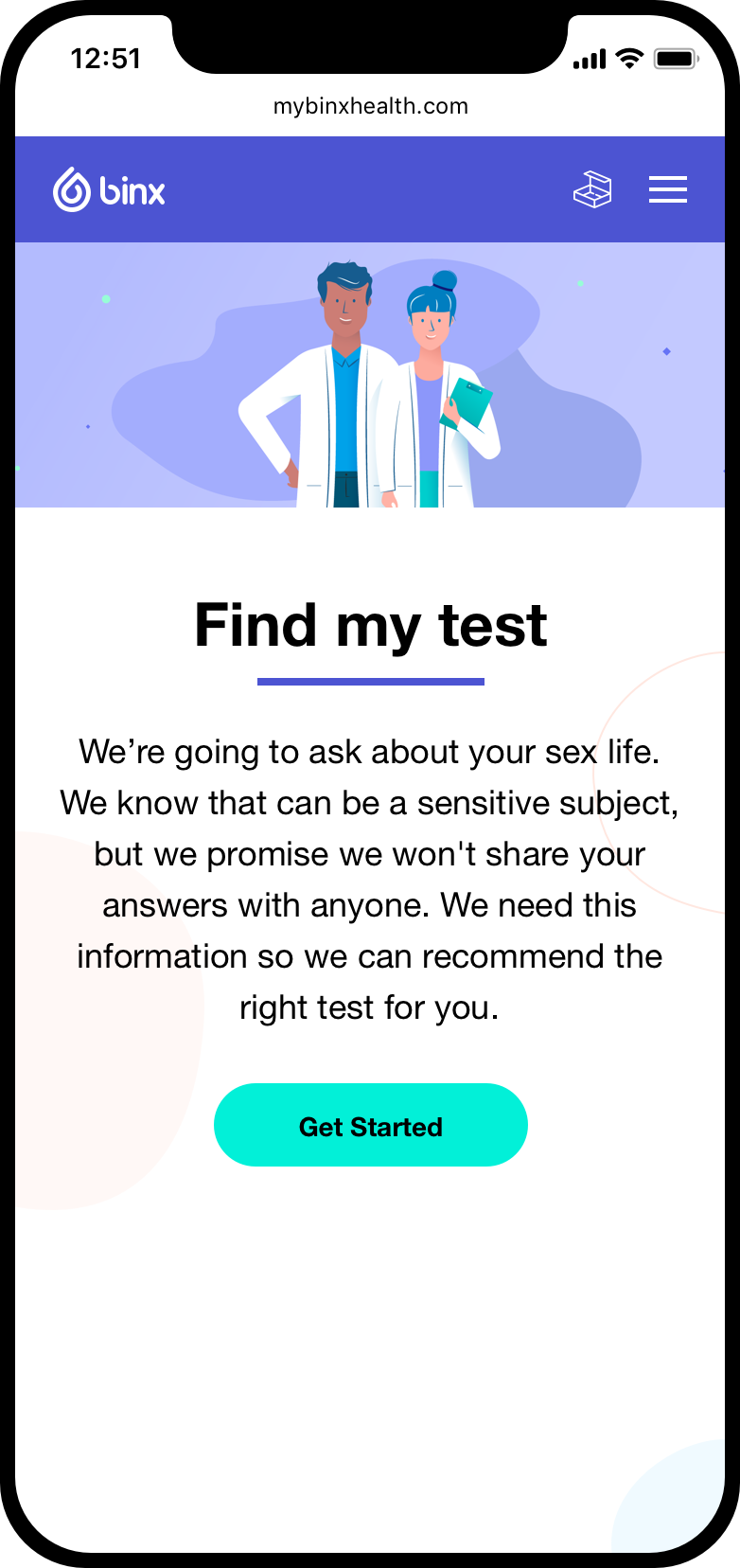
Our updated B2C site would only display information about our binx risk assessment app, at-home testing kits, and relevant information our at-home consumers would need in order to get the right testing kits and results.


Come back for more updates.


