
Chewy
Chewy is the largest pet e-commerce in the U.S. Know for it’s friendly customer service and love for all pets.
Building A New Design System At Chewy
At Chewy, we want to create harmonious experiences for our users. To achieve this we created CDS 3.0 (used in place of our code name), our design system that provides design guidelines to help designers quickly create a beautiful, accessible, and consistent experience across our platforms.
CDS 3.0 includes the resources to create user interfaces consistent with Chewy design principles, language, and best practices. Rather than focusing on pixels, developers can focus on application logic, while designers can focus on user experience, interactions, and flows.
But before I could even start exploring ideas for our new design system, I first wanted to make some updates to our existing version. Updates that would address accessibility issues and inconsistencies. To do this I needed to do a complete audit of our website, on both desktop and mobile web. The audit took a few sprints and I was able to put together a detailed presentation of my findings to leadership and my design system team. These findings led to a lot of tickets and a better plan moving forward.
Before we go into the audit, I want to show the roadmap I created a few weeks after I joined Chewy. This shows our plan for the design system team for the year.

UI Audit
Purpose of the audit:
To gather any and all components and design elements used throughout Chewy’s website. Our goal was to consolidate our UI kit and bring more consistency to our web platform. This process always takes time, and while our ultimate goal is to revamp our design system, we have to take small steps and tackle a few issues along the way.
First and foremost, we at Chewy are pushing to update our site to be more user-friendly and accessible to everyone. V1 of the design system update focused on accessibility. Some changes are minimal, others are more noticeable, but we wanted to make sure our site met accessibility standards as set by the Web Content Accessibility Guidelines (WCAG) 2.0.
Things that stood out:
Accessibility issues - Little things like color contrast was a big issue in a lot of our pages. From our primary button to copy over colored backgrounds to labels in forms, the text was hard to read and did not meet WCAG 2.0 AA accessibility standards.
Inconsistencies in our brand - There were many cases where the primary blue being used in one page did not match the primary blue in other pages. Important badges like our “Autoship” badge had many variations throughout the site - this is a big issue for a feature as important as a recurring purchase. If the user can’t recognize this feature, the value is lost and so are potential purchases.
Too many assets - I learned our icon library was huge and what was worst is we had a lot more that were being hardcoded on storefront, which resulted in many more icons and in most cases duplicates of existing ones. We also had several different alerts components for each type of message. All these things added to our technical debt.
Samples:

Audit of our Autoship badges throughout our web and mobile web pages.

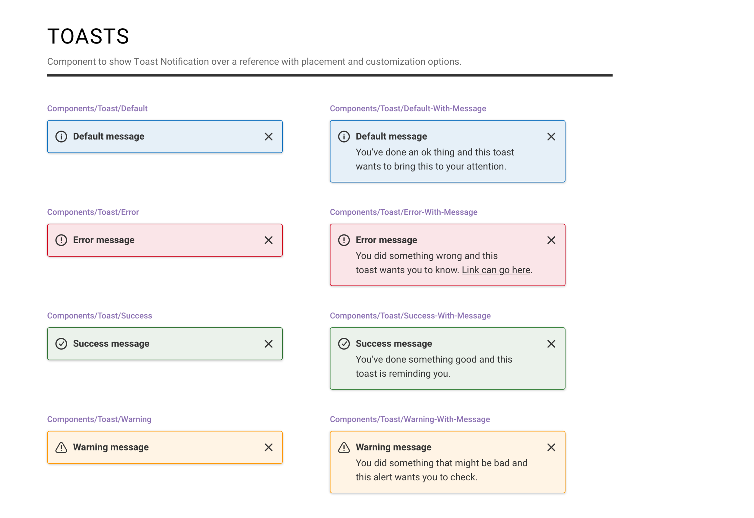
Audit of our alert messages.

The audit helped us see not only inconsistencies in components, but also layouts.

Audit of our buttons styles.

Just a tiny sampling of the plethora of icons that were used. Why so many "x” buttons?
What next?
While our design system engineers worked on addressing accessibility issues, removing duplicate icons/components, and cleaning up code, I spent several weeks building a UI library (using Sketch and InVision Design System Manager) for our design team. Part of the problem with the inconsistencies is that designers didn't have a pattern library, which resulted in different styles from page to page. The UI library would include typography styles, colors, icons, components, templates, and guidelines around these to be followed. This UI library would include updates our engineers were working on.
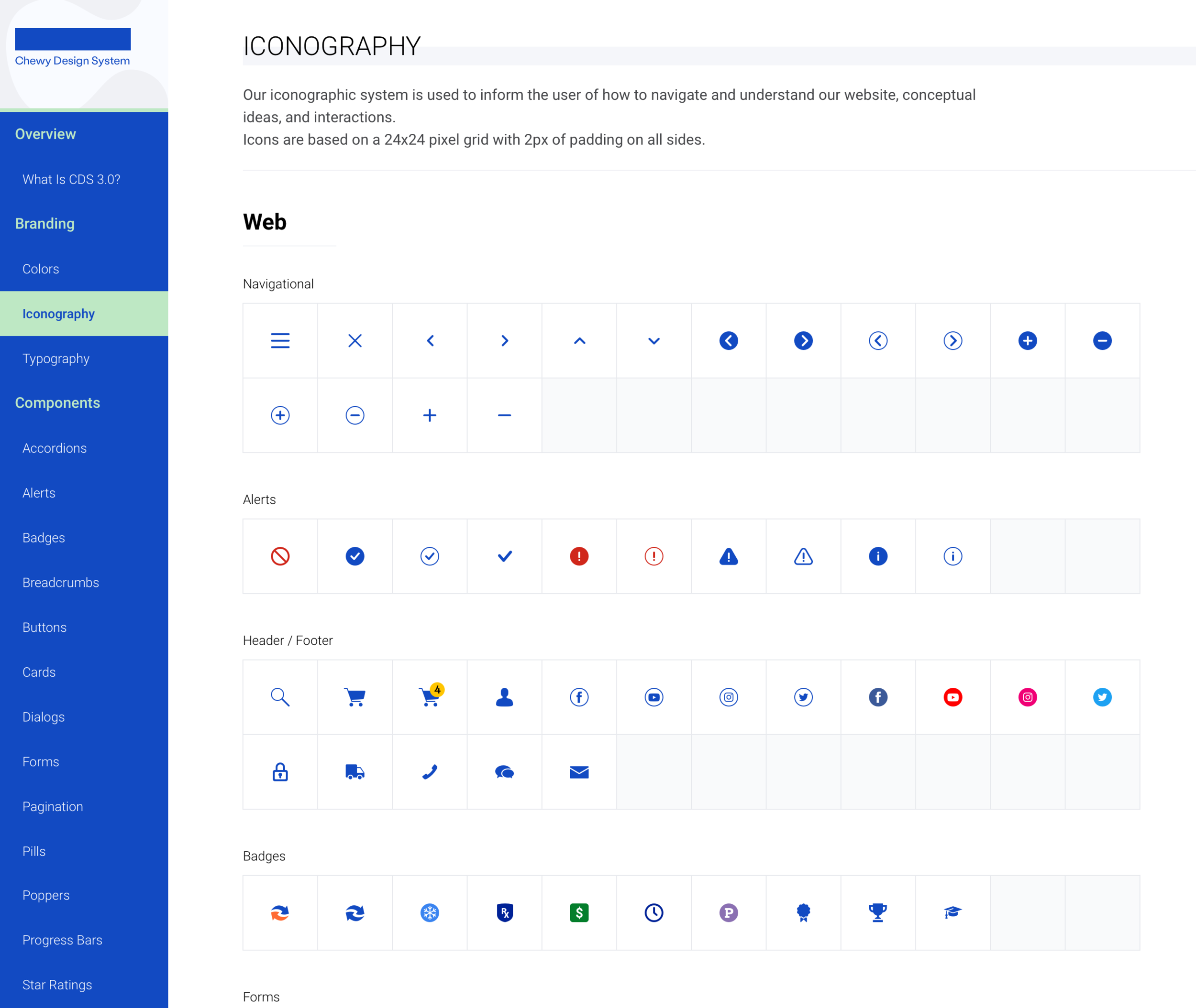
Some samples of the UI library:


CDS 3.0
And here’s where the fun starts. In case the audit wasn’t a blast already! The beauty of creating a new design system is that you’re building the UI library along the way, which can be made available to the design team even before engineers have finished building it on their end.
Below are some screenshots of the new design system. I won’t show too much since there are a lot of branding elements that are confidential and other sections are still being worked on. Like all design systems, CDS3 is not or will ever be final. Design systems should scale and evolve along with your brand.


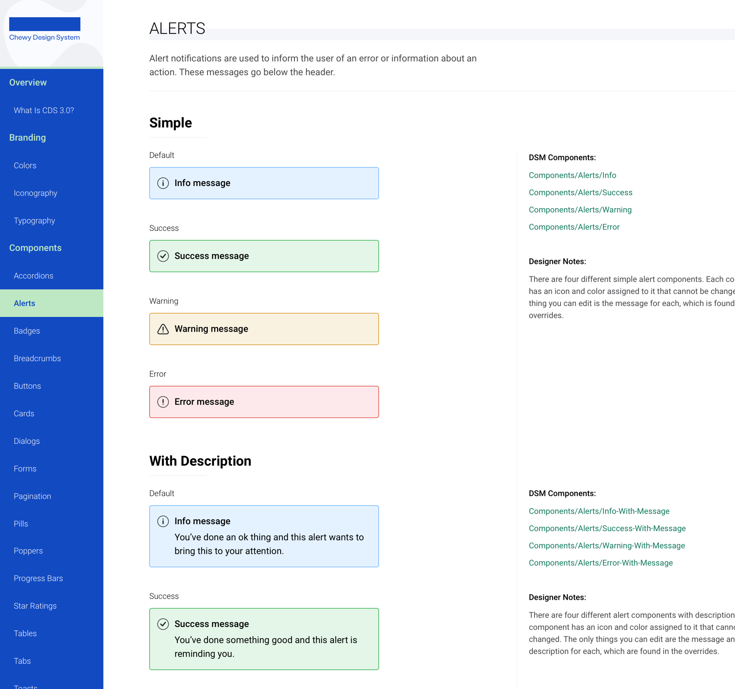


Come back for more updates.


